Il progetto.
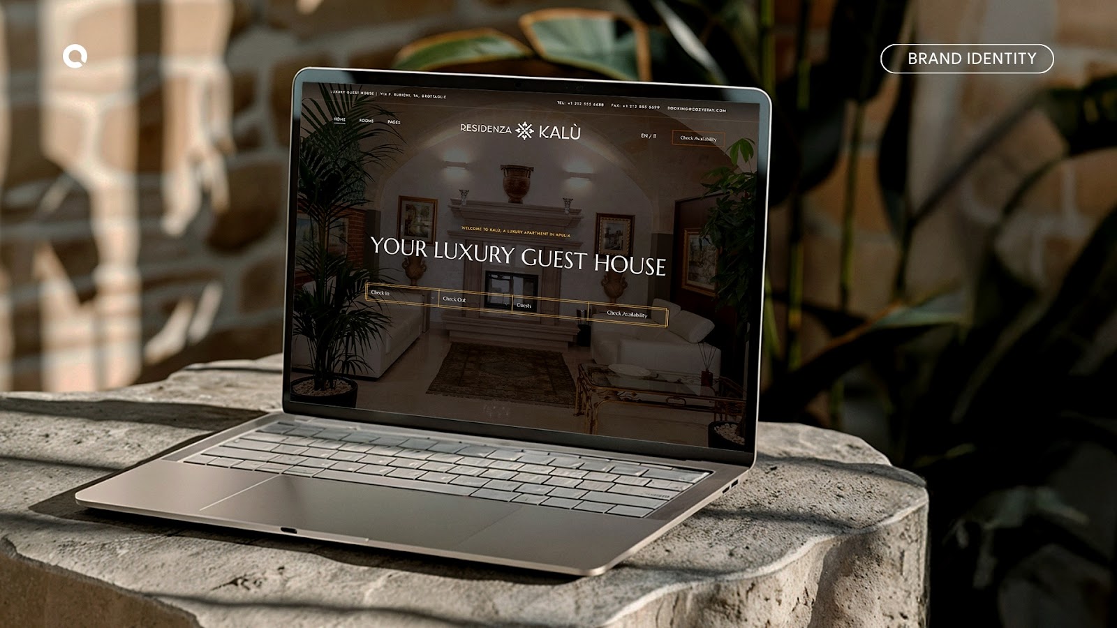
Residenza Kalù was created as a refuge for the soul, a place where tradition and contemporary living come together, where slowness becomes a precious value and hospitality transforms into an experience to be lived and passed down.
The visual identity project takes shape from the encounter between memory, craftsmanship, and authenticity, translating these values into an essential, warm, and distinctive visual language. Every element of the brand tells the story of a place that preserves its heritage while reinterpreting it with elegance and balance.
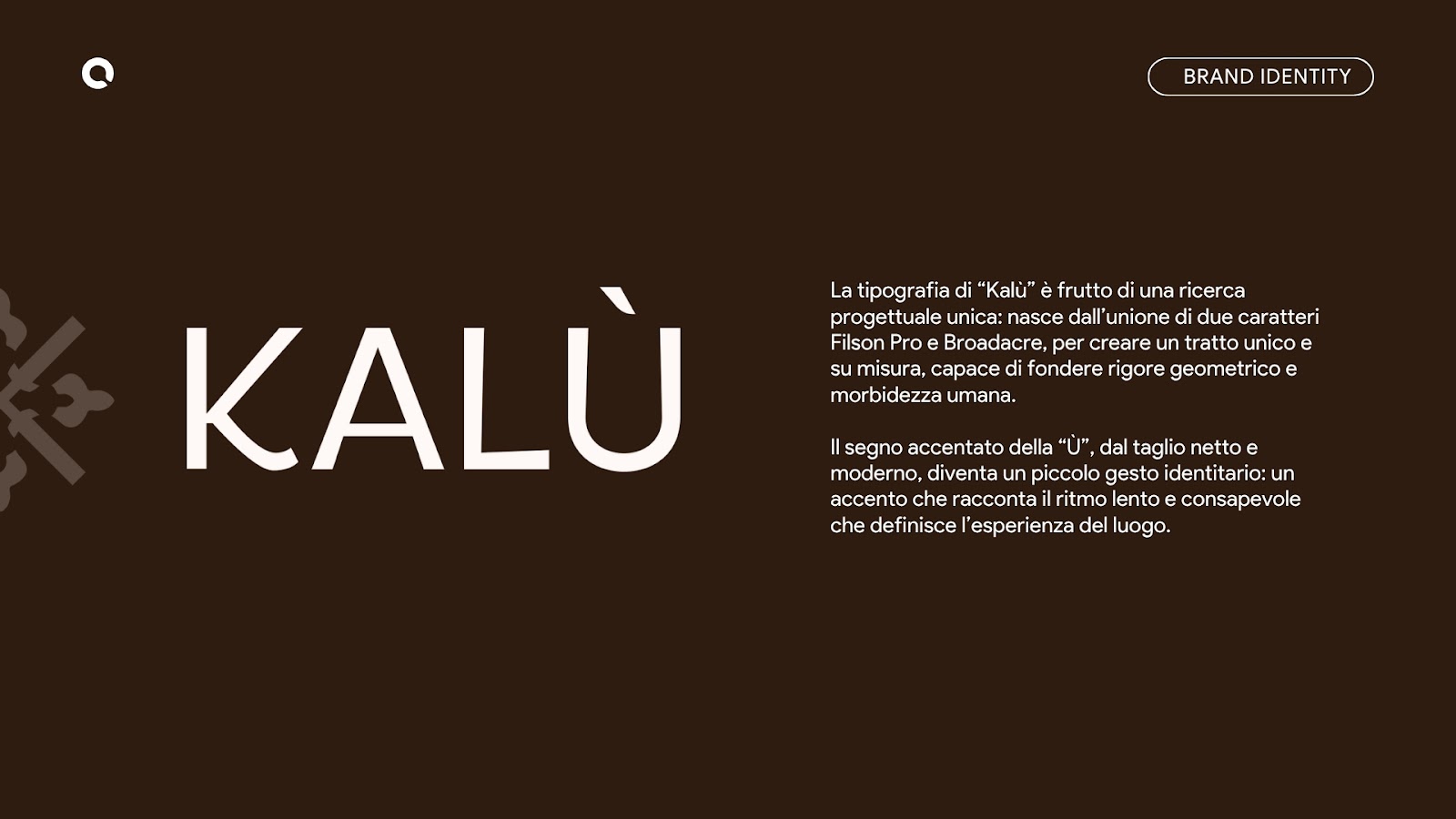
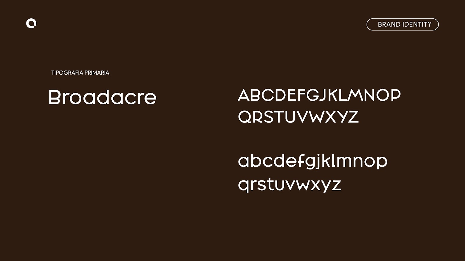
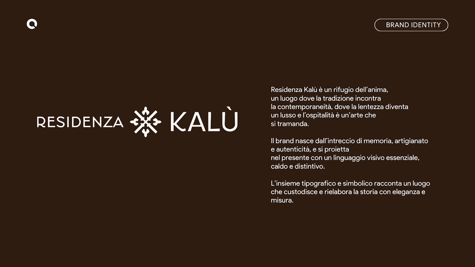
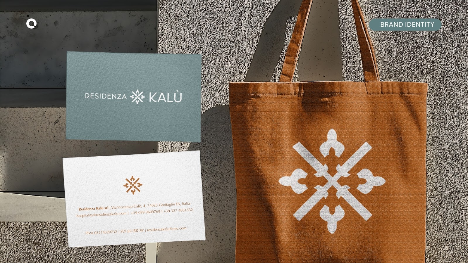
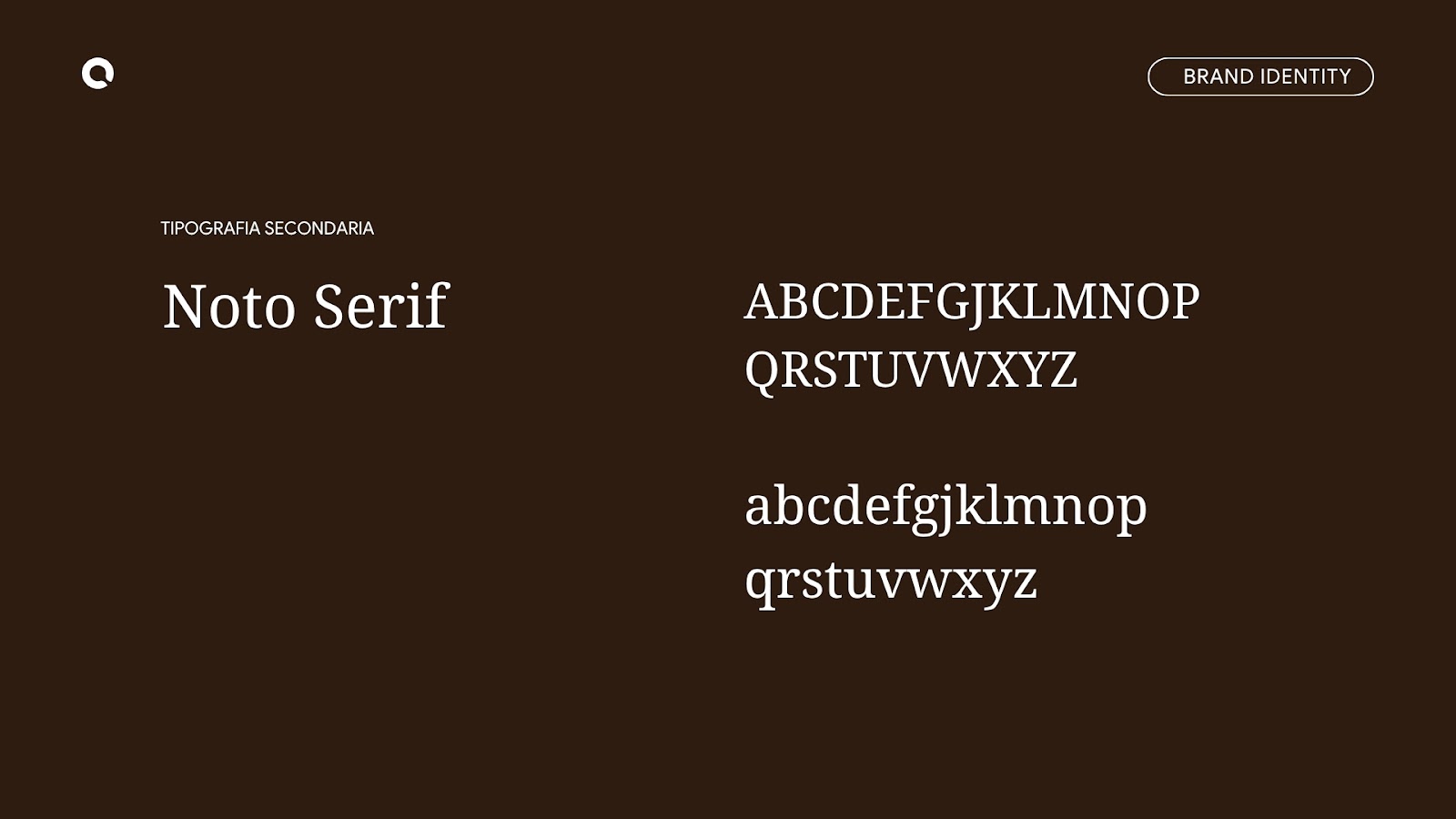
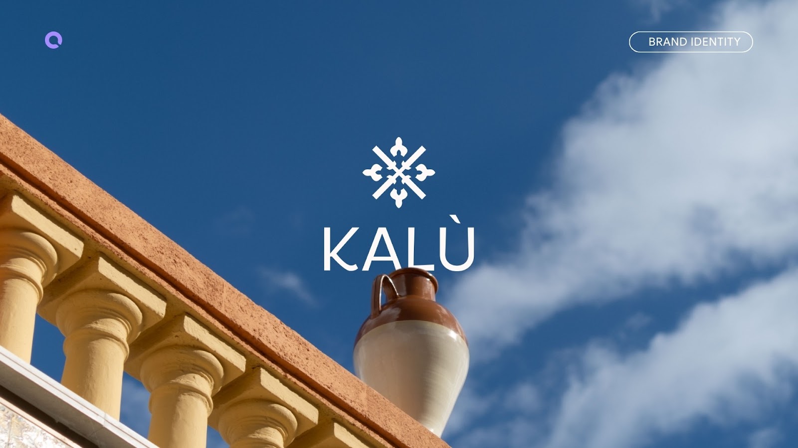
The “Kalù” wordmark is the result of a bespoke typographic research, created through the fusion of the Filson Pro and Broadacre typefaces: a balance between geometric precision and softness, between contemporary structure and artisanal sensitivity. The distinctive accent of the “Ù”, with its sharp and modern cut, becomes an identifying detail that reflects the slow and mindful rhythm of the experience offered by the residence.
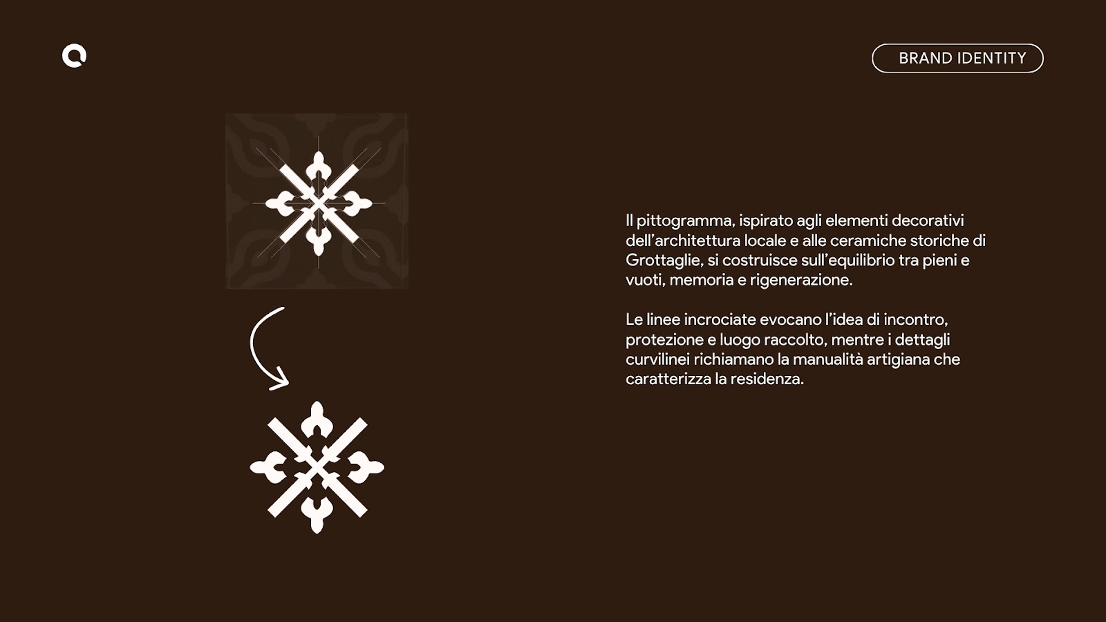
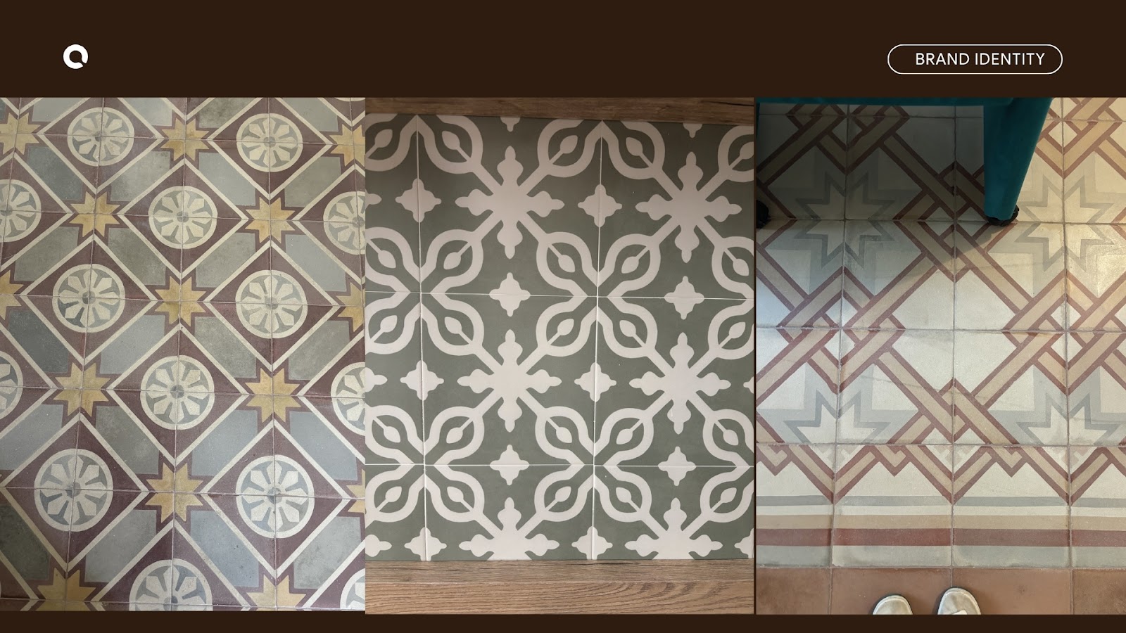
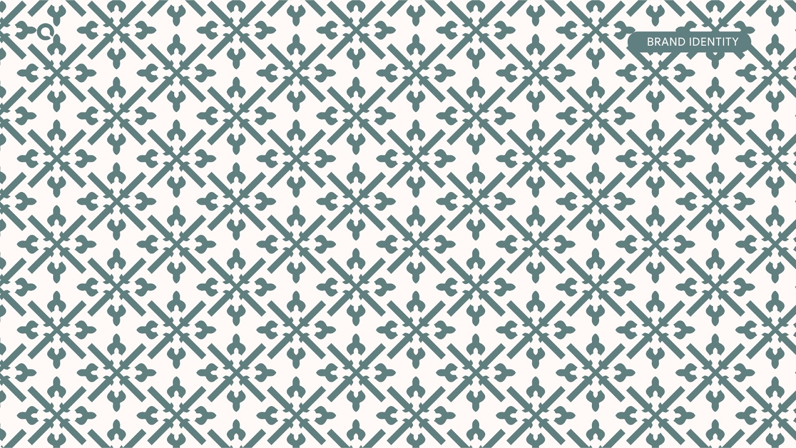
The pictogram draws inspiration from the decorative elements of local architecture and the historic tradition of Grottaglie’s ceramic , reinterpreting them through a system of balanced forms between positive and negative space, heritage and renewal.
The intersecting lines evoke the ideas of connection, protection, and a welcoming sense of place, while the curved details recall the craftsmanship and the value of handmade work.
A visual identity designed to tell the story of an authentic place, where every detail becomes a connection between memory, material, and hospitality.